Exhibition
in Biel/Bienne / Switzerland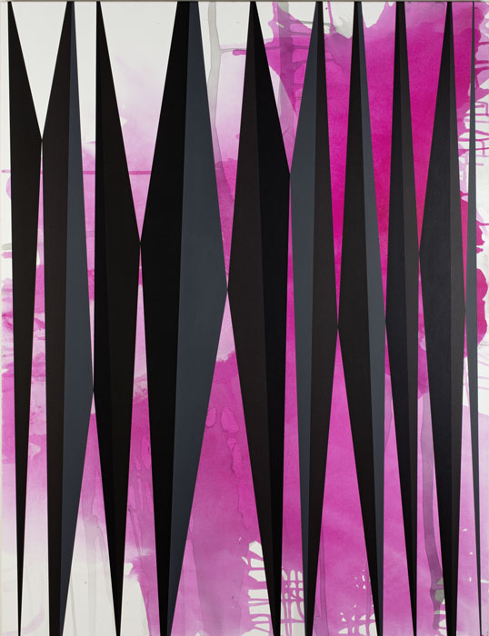
-

- Clare Goowin: Louise and Stuart, 2015, Acryl and acrylic ink on canvas, 170 x 130 cm, Courtesy the artist, photo: Stefan Rohner
Clare Goodwin’s (*1973, GB) paintings present formally precise, hard-edge compositions, reduced to line, shapes and patterning. Her habit of titling the works with English names common in the past introduces humour and intimacy into the usually austere realm of geometric abstraction. The paintings are thereby imbued with possible narratives as well as references to real and fictional people. Although Goodwin’s work may appear to be situated in the legacy of the Zurich Concrete artists, it is her engagement with an emotional, abstract representation of the external world that distinguishes her approach from their mathematical logic and rejection of the depiction of reality. The exhibition sets up a conversation between a new group of paintings and a selection of older works, recent sculptures, objects and spatial interventions. Although 10 years apart, these different bodies of work all originate in Goodwin’s reductive approach, often inspired by discarded items dating from the 1970s and 80s. In terms of both their aesthetic qualities and their symbolism, these acquire the status of contemporary “memento mori”.
Although Goodwin is known primarily as a painter, her work crosses over into other areas such as sculpture, wall painting and the integration of objects in spatial situations in which the environment is part of the work. Based on patterns found on old fabric and knick-knacks that convey a certain sense of time, history and loss, her paintings can be regarded as contemporary icons of another era. From the earliest “Kitchen Paintings” to the most recent works composed of painted shards and slices, Goodwin’s work has undergone a dramatic development. The formal precision of her work and its hard-edge geometric language evolved in the late 1990s. The repeated pattern motifs and compositions based on strong vertical and horizontal lines became a central style in the early 2000s in the “Kitchen Paintings”, which were based on images from 1970s lifestyle magazines depicting idealized modular kitchens system and interiors.
Goodwin began to develop two new series of paintings in 2011 and 2013, “Kiss on the Blue” and “Unforced Errors”. These focussed on a stark formal composition of intersecting stripes, on line and form rather than on tone, giving way eventually to purely black paintings. The floaty washes that the artist started to incorporate in her work in the newest series “Curtain Paintings” in 2015 were a radical departure. The process used to make these begins with the gestural act of applying ink, the flow of which is interrupted by the superimposed layer of long, narrow diagonal forms in black and grey. Although a stark contrast to the “Kitchen Paintings”, they also represent a return to these, since their title evokes the ambiguous transition between interior and exterior space. Evoking not only the colours and designs of Goodwin’s growing collection of used clothes, but also the smells of the people who once owned them and the environments in which they might have been worn, these more abstract paintings nonetheless represent tangible aspects of reality.
The notion that her paintings are a form of abstract portraiture is emphasised by Goodwin’s custom of titling her paintings with British names common among adults in the 1970s and 80s. Based on the reduction of a shared history to line and pattern, these works rely on the titles to trigger storytelling. The choice of narratives, some of them potentially romantic or humorous, has an oddly humanising effect on the clean and ordered world of the geometric abstract aesthetic. It also distinguishes Goodwin from the Concrete artists.
Goodwin has always been interested in the space of painting, whether through the architectural environments of the “Kitchen Paintings” or the illusion of space in the recent compositions. The one-to-one ratio – by which everything depicted is the size it has in reality – is a central factor throughout the artist’s work, while her installations, environments and wall paintings extend the multiple points of view and sense of movement in the paintings. The concept has even been extended to the publication produced to accompany the exhibition, for which Goodwin has made a group of 60 or so coloured paintings for reproduction on a one-to-one scale.
Curator of the exhibition: Felicity Lunn, Director Kunsthaus CentrePasquArt Biel Bienne
Publication accompanying the exhibition: A richly illustrated publication designed by NORM and published by the Verlag für moderne Kunst, will be released at the end of February.
Opening hours Tues-Fri 2 – 6 pm, Sat/Sun 11 am – 6 pm
Die Gemälde von Clare Goodwin (*1973, GB) sind – auf Linien, Formen und Muster reduziert – formal präzise “hard-edge” Kompositionen. Ihre Gewohnheit, die Werke mit englischen Namen, die in der Vergangenheit gebräuchlich waren, zu betiteln, erweitert das nüchterne Feld der geometrischen Abstraktion um Humor und Intimität. Den Gemälden werden dadurch mögliche Erzählungen sowie Bezüge zu realen und fiktiven Menschen eingeschrieben. Goodwin bewegt sich nur scheinbar im Kontext des Erbes der Zürcher Konkreten. Von deren mathematischem und logischem Konzept unterscheidet sie sich durch ihren Ansatz einer abstrahierten, emotionalen Repräsentation der sichtbaren Welt. Goodwins Ausstellung eröffnet einen Dialog zwischen neueren Gemälden und einer Auswahl älterer Arbeiten, sowie aktuellen plastischen Werken und Objekten, welche sie in räumliche “Environments” einbettet. Auch wenn zehn Jahre zwischen der Entstehung einzelner Werkgruppen liegen, wurzeln sie alle in Goodwins reduktionistischem Ansatz und sind von ausrangierten Gegenständen aus den 1970er- und 80er-Jahren inspiriert. Durch ihre ästhetischen und symbolischen Qualitäten erlangen die Gemälde den Status von zeitgenössischen “memento mori”.
Obschon Goodwin vorwiegend als Malerin bekannt ist, geht ihre Arbeit in andere Bereiche über wie die Skulptur, die Wandmalerei und die Einbeziehung von Objekten in “Environments”, in denen die Umgebung Teil der Arbeit ist. Ausgehend von vorgefundenen Mustern auf altem Stoff und Schnickschnack, die ein Gefühl von Zeit, Geschichte oder Verlust vermitteln, können ihre Gemälde als Ikonen einer anderen Ära betrachtet werden. Angefangen von den frühesten “Kitchen Paintings” bis zu den jüngsten Werken, die an gemalte Scherben und Schnitte erinnern, hat Goodwins Arbeit einen fundamentalen Wandel durchlaufen. Die formale Präzision und die geometrische “hard-edge” Formensprache ihrer Werke haben sich in den späten 1990er-Jahren herausgebildet. Die wiederkehrenden Motive und Kompositionen aus markanten vertikalen und horizontalen Linien wurden zu einem zentralen Stilelement der “Kitchen Paintings” der frühen 2000er-Jahre, welche auf Bildern aus Lifestyle-Zeitschriften der 1970er-Jahre basieren, die ideale modulare Küchensysteme und Innenausstattungen zeigen.
Goodwin begann 2011 und 2013 mit “Kiss on the Blue” und “Unforced Errors” zwei neue Werkgruppen von Gemälden zu realisieren. Der Fokus lag auf der strengen formalen Komposition sich überkreuzender Streifen, auf Linie und Form und weniger auf der Farbgebung und brachte schliesslich gänzlich schwarze Gemälde hervor. Die verlaufenden Tintenlavierungen, welche die Künstlerin 2015 im Rahmen ihrer neuesten Serie “Curtain Paintings” einzubeziehen begann, waren ein radikal neuer Ansatz. Der Prozess dieser Gemälde beginnt mit einem gestischen Schwung des Auftragens von Tinte. Der Fluss der Tinte wird unterbrochen durch die sie überlagernden Schichten mit langen, schmalen, dreieckigen Formen in Schwarz und Grau. Trotz des starken Kontrasts zu den “Kitchen Paintings”, stellen sie auch eine Rückkehr zu ihnen dar, da ihre Titel den Übergang zwischen Innen- und Aussenraum heraufbeschwören. Nicht nur die Farben und Designs von Goodwins wachsender Sammlung abgenutzter Kleider werden dabei in Erinnerung gerufen, sondern auch der Geruch der Menschen, die diese Kleider einmal besassen sowie das Umfeld, in welchem diese möglicherweise getragen wurden. Obschon es sich um nahezu abstrakte Gemälde handelt, vermögen sie trotzdem konkrete Aspekte der Wirklichkeit wiederzugeben.
Die Tatsache, dass ihre Gemälde eine abstrakte Form der Porträtmalerei sind, zeigt sich in Goodwins Verfahren, ihre Gemälde mit gebräuchlichen britischen Namen von Erwachsenen in den 1970er- und 80er-Jahre zu betiteln. In ihrer gemeinsamen Geschichte der Reduzierung auf Linie und Muster sind es bei diesen Arbeiten die Namen, die die Geschichte in Gang setzen. Die möglichen Erzählungen, romantische oder witzige, vermenschlichen die sterile und geordnete Welt der geometrischen abstrakten Ästhetik, wodurch Goodwin sich von den Zürcher Konkreten unterscheidet.
Es ist offenkundig, dass Goodwin sich schon immer für den räumlichen Aspekt des Bildes interessiert hat, ob es die architektonischen Umgebungen der Kitchen Paintings sind oder die Illusion von Raum in den aktuelleren Arbeiten. Das 1:1-Verhältnis ist durchgehend ein zentraler Faktor in ihrer künstlerischen Arbeit, während ihre Installationen, “Environments” und Wandmalereien eine zusätzliche Erweiterung der vielfältigen Blickwinkel und des Momentes der Bewegung in den Gemälden darstellen. Dieser Ansatz hat sie für die Publikation, die anlässlich der Ausstellung erscheint, noch erweitert. Goodwin realisierte dafür eine Serie von 48 farbigen Gemälden, die im genauen Grössenverhältnis von 1:1 abgedruckt werden.
Kuratorin der Ausstellung: Felicity Lunn, Direktorin Kunsthaus CentrePasquArt
Publikation zur Ausstellung: Ende Februar 2016 erscheint eine reich bebilderte Publikation, gestaltet von NORM, beim Verlag für moderne Kunst.
Öffnungszeiten Di-Fr 14 – 18 Uhr, Sa/So 11 – 18 Uhr
Les peintures de Clare Goodwin (*1973, GB) présentent des compositions ” hard-edge ” formellement précises, réduites à des lignes, des formes et des motifs. Cependant, son habitude de titrer ses œuvres avec des prénoms anglais communs dans le passé introduit une touche d’humour et d’intimité dans le domaine habituellement austère de l’abstraction géométrique. Cela insuffle aussi aux peintures de possibles narrations ainsi que des références à des personnes réelles ou fictives. A première vue, l’œuvre de Goodwin peut paraître l’héritière des concrets zurichois. Cependant, elle se distancie de leur concept mathématique et logique par la proposition d’une représentation abstraite et émotionnelle du monde visible. L’exposition instaure un dialogue entre de nouvelles peintures et une sélection d’œuvres plus anciennes, ainsi que des sculptures et des objets récents, intégrés dans des ” Environnements ” sur mesure. Bien que séparés de dix ans, ces différents corps d’œuvres sont tous nés de l’approche réductionniste de Goodwin, souvent inspirée par des objets mis au rebut datant des années 1970 et 1980. Par leurs qualités esthétiques et leur symbolisme, elles acquièrent le statut de ” memento mori ” contemporain.
Si Clare Goodwin est surtout connue en tant que peintre, l’artiste se permet aussi des incursions dans d’autres domaines tels la sculpture, la peinture murale ou encore l’intégration d’objets dans des ” Environnements ” où la situation est une composante du travail. En utilisant des motifs se trouvant sur des objets désuets, sortes de babioles qui véhiculent une certaine perception du temps, de l’histoire ou de la perte, ses peintures peuvent être considérées comme des icônes contemporaines d’une autre époque. Depuis les premières “Kitchen Paintings” jusqu’aux travaux les plus récents composés de lamelles et de fragments peints, l’œuvre de Goodwin a subi une évolution spectaculaire. La précision formelle de son travail ainsi que son langage géométrique ” hard-edge ” ont évolué à la fin des années 1990. Les motifs répétés de modèles et de compositions de papiers peints, basés sur un solide réseau de lignes verticales et horizontales, sont devenus au début des années 2000 un élément stylistique essentiel de ses “Kitchen Paintings” qui s’inspiraient de photographies puisées dans les Lifestyle Magazines des années 1970.
En 2011 et 2013, les deux séries de peintures “Kiss on the Blue” et “Unforced Errors” marquent un tournant important. Dans ces travaux, l’accent est mis sur une composition formelle rigoureuse, s’appuyant sur la ligne et la forme plutôt que sur le chromatisme, aboutissant finalement parfois à une peinture purement noire. Les vaporeux lavis d’encre incorporés dans la nouvelle série “Curtain Paintings” (2015) marquent un changement radical. Le processus auquel recourt Goodwin commence par l’acte gestuel de l’application de l’encre pour le fond de l’œuvre. Les écoulements sont interrompus par de longues et étroites formes triangulaires de couleurs noires et grises. Même si ces séries sont fortement contrastées, “Curtain Paintings” constitue une sorte de retour vers “Kitchen Paintings” en évoquant la transition ambiguë entre l’espace intérieur et extérieur. Ces peintures abstraites reprennent non seulement les motifs et couleurs propres aux vêtements usagés issus de la collection en cours rassemblée par l’artiste, mais aussi les odeurs des personnes auxquelles ils ont appartenu, de même que les lieux dans lesquels les fripes ont été portées. Par ces évocations, les œuvres plus abstraites de Goodwin intègrent des aspects tangibles de la réalité.
L’idée que ses peintures sont une forme de portraits abstraits est accentuée par l’habitude de Goodwin à donner à ses œuvres pour titre des noms britanniques courants dans les années 1970-1980. Basées sur le partage d’une histoire réduite à des lignes et à des motifs, ces œuvres misent sur les noms pour déclencher le récit. Le choix des narrations, dont certaines sont potentiellement romantiques voire humoristiques, humanise l’univers net et bien ordonné de son esthétique abstraite et géométrique. C’est aussi ce qui distingue Clare Goodwin des artistes concrets zurichois.
Goodwin s’est toujours intéressée à l’espace pictural, qu’il s’agisse des cadres architecturaux des “Kitchen Paintings” ou de l’illusion spatiale dans ses compositions récentes. L’échelle réelle – tout est dépeint dans sa juste dimension – est un facteur central dans le travail de l’artiste et ses installations, ses interventions spatiales et ses peintures murales ont encore accru la multiplicité des points de vue et la sensation de mouvement face aux peintures. Cette approche a également été étendue à la publication accompagnant l’exposition, pour laquelle Goodwin a réalisé 48 peintures en couleur reproduites grandeur nature.
Commissaire de l’exposition : Felicity Lunn, directrice Centre d’art CentrePasquArt
Catalogue d’exposition : La maison d’édition Verlag für moderne Kunst publiera fin février 2016 un ouvrage richement illustré, conçu par NORM.
Heures d’ouverture Ma-Ve 14h – 18h, Sa/Di 11h – 18 h
Location:
Kunsthaus Centre d’art Pasquart
Seevorstadt 71 Faubourg du Lac
2502 Biel/Bienne
Switzerland